Spirant Group Branding
The Brief: Create a brand identity for a group of companies
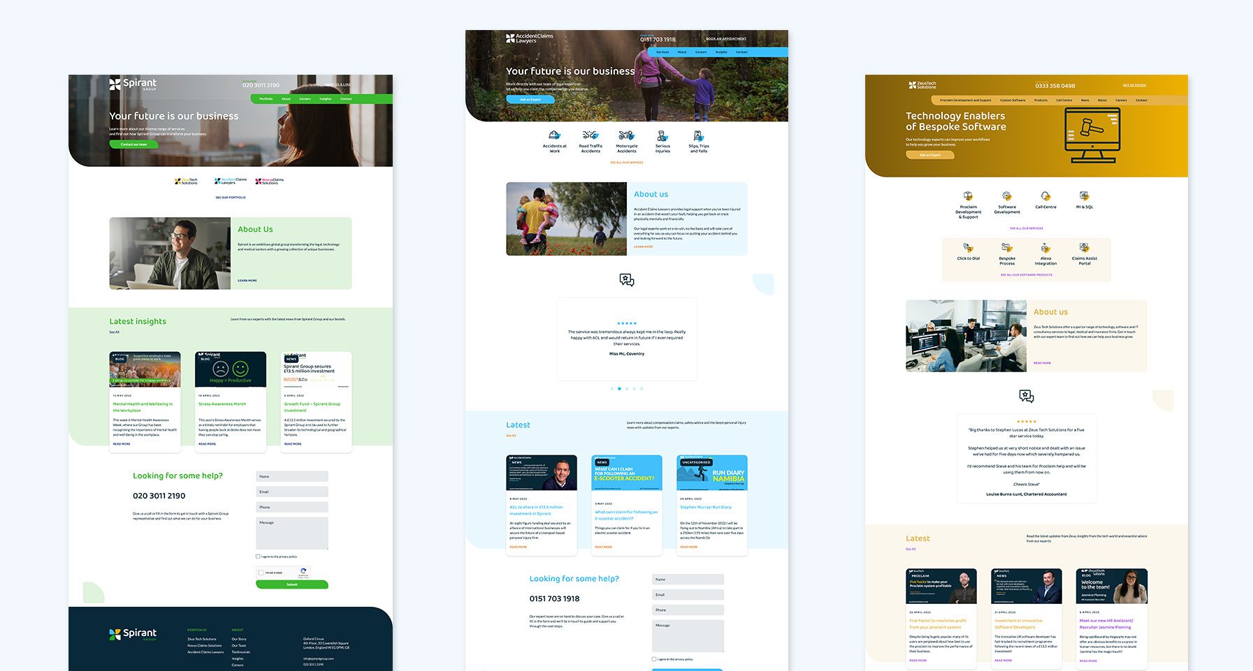
The Spirant Group is a global group of businesses operating in the legal, technology and medical sectors across the UK, Australia and the US. Spirant came to us originally as Rhea Group, with a number of different businesses/brands that had a range of very disjointed identities. They wanted the overall brand style to encapsulate the top level ethos of the group whilst still allowing each of the business units to have a sub-brand which reflected their own unique personality. An added factor was that even within some of the sub-brands there was a need for regionalisation to cater for the different tastes of contrasting markets like the UK and Australia.
The initial requirements included looking at the brand strategy, defining the company’s purpose in the marketplace and exploring how best to communicate with their customers and make an emotional connection. Additionally, they wanted their brand structure to be flexible enough to suit any future changes such as additional sub-brands being added to the group. As a business their success was intrinsically based on the expertise of their team – so a key requirement was to ensure the key personnel were consulted and involved in the brand development process.
The second part of the brief was to build the branding elements based on the findings from the branding strategy and incorporate these into one all encompassing brand guidelines document. As part of the roll out of the brand the identity needed to be applied to all marketing collateral including stationery, presentations, social channels and, last but not least, a suite of websites for the overall group and four sub-brands, plus a regional variation for Australia.