Manchester Art Gallery Logo

UX Design and Website Build for Fine Art Gallery

Manchester Art Gallery Website 

The Brief: Create a website to showcase beautiful artwork whilst delivering income generation

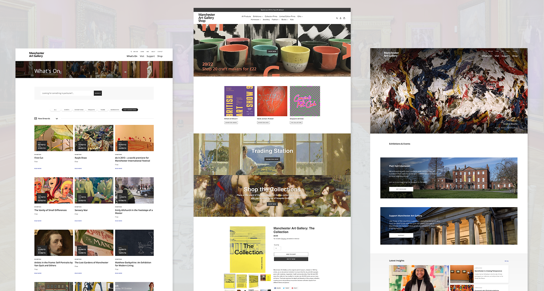
Manchester Art Gallery has been a major landmark in Manchester city centre since 1835. The historic gallery houses an important collection of over 6,000 pieces of art and more than 13,000 decorative objects. They approached us with the brief of creating a new website that would act as a focal point for all promotional and event activity going forward, as well as positioning the organisation as a leading gallery to an international audience.

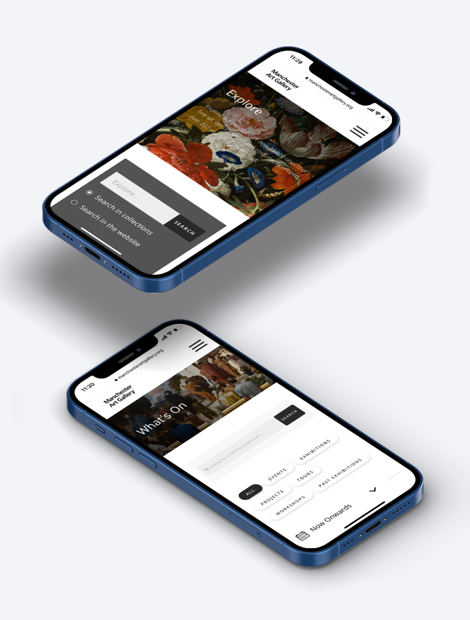
The main objective for the website was to create a platform that not only showcased the stunning art in the gallery’s collection, but provided an easy to use, self-service platform for the varied audiences that use the gallery. Although operated as a ‘not for profit’ operation, the gallery needs to generate its own revenue via a number of commercial avenues including venue hire, commercial licences for artwork, gift sales, legacies, membership and event bookings. They needed the website to play a more central role in this income generation and have much clearer calls to action. There were numerous UX issues with the existing site that meant visitors often struggled to find what they were looking for and ended up having to ring up for clarification. 

Last but not least, an important aspect of the brief was to address the issues with the construction of the website and the CMS, which the management team found clunky and difficult to use. A way of future-proofing the site for future additions was also requested so that the team could add in new pages and sections themselves.

The Solution

A new UX design to deliver structure and clear user journeys

Following detailed discovery sessions with the team at Manchester Art Gallery, we sketched out a plan for the new website that would mean information was located in a structured way and not duplicated in each section of the site. This hinged around a dual navigation bar with frequently used information located in the primary menu – What’s On, Visit, Support and the Shop. A secondary menu was then created to cater for those looking to delve a bit deeper into what the gallery has to offer – Explore, Learn, Hire, About and Contact. Crucially we also added clear user journeys for the key income generation areas in the new design that inspire users to action. This brought the gallery’s commercial avenues to the fore such as venue hire, membership, donations and the online shop. 

Once the new structure fell into place, we turned our attention to the CMS and developed a modular design in WordPress that would be flexible and easy to use for the different departments within the gallery. With so much beautiful artwork to feature, the process of image uploading and display was central to the design of the website and CMS functionality. Enabling a mobile-first approach was also top of the priority list, so we created a design that worked effectively across all devices, whilst at the same time focusing on site speed and stability. The new website is now a platform the gallery can use to showcase their beautiful collections as well as a practical tool for visitors and staff alike. With the scalable nature of the modular design, the team are delighted to have a website that will adapt with the gallery for many years to come.

  • Discovery Sessions

  • UX Design

  • WordPress CMS

  • Modular Design